I always thought that it would be impossible for me to make convincing looking websites. But I did learn it and enjoy it very much. But as soon as I’m ready with a new, beautiful web page on my screen, my joy is cut short by the fact that I still need to make it responsive. Learning website development is in fact a double battle: first learning the techniques to make nice things on a web page, and then learning another set of techniques on how to keep the design beautiful on smaller screens. In my experience, the latter battle is way bigger, and thus hope that sharing the lesson I learned will save someone from the agony I had to go through. I’ll focus on modals because making them responsive has been the toughest part for me.
So, in this article I’ll discuss how to make modals responsive in Oxygen Builder for WordPress. (A modal can also be called a modal window or lightbox.) This advice may help users of other website design tools but I’m only familiar with Oxygen.
The main function of a modal is to draw the website visitor’s attention to itself and try to persuade the visitor to take a certain action (reading a message and clicking “OK”, filling out a form, etc.). In fact, I’ve used the modals in perhaps a bit unconventional way – to show the reader additional information. I’ve set the modals to be triggered by a button click so that viewing the modal is optional for the visitor. I’m not sure how common this kind of use of a modal is but I’ve found it practical!
Anyway, most of the modals I’ve made so far have been very simple in a way that they only contain text, mostly just a couple of sentences. This kind of small and simple modals usually fit the screen without any tweaking when it comes to responsiveness.
But many of the modals I’ve created are higher than the screen, some already on laptop screens. For example, a contact form in a modal easily becomes too high to fit the laptop screen. Unlike you could imagine, it doesn’t shrink to fit the screen even on laptop size (or I just don't know how to do it). Nor does it automatically get a scrollbar either.
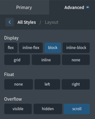
The answer is (...drum roll...): block element + overflow: scroll + fixed element height!
What does that mean exactly? It means that you need to set element display to "block", select value "scroll" for overflow and give the element a fixed height. In Oxygen, you'll find the first two settings in the Advanced tab, under Layout. The height is defined under Size & Spacing. So simple when you know it!
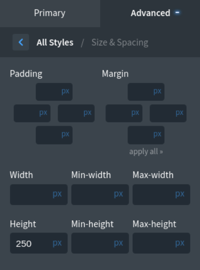
There is a further trick in setting the height: it needs to be smaller than the screen height because that’s the area in within the element will scroll. You'll understand this when you start with smaller kind of values, for example with 200 pixels and increase the value if necessary. So don't try to set the element height as high as the element really is. This is where I used to bang my head to the wall for quite a while…
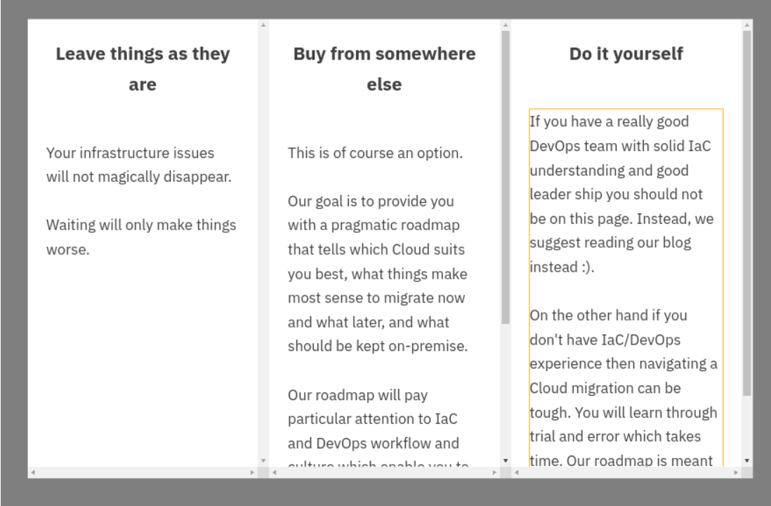
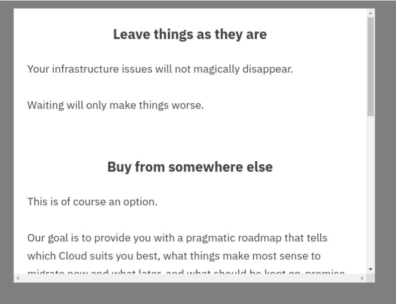
I have another tip for you as well, regarding column layout. When you have a column layout in a modal, the columns start to stack vertically at some point, usually at under 992 pixels. That’s when you need to add a scroll to the modal and it needs to be added to the column element. In larger screens, when the column divs are stacking horizontally, and the column divs are too high to fit the screen, you need add the scroll to the div element instead. If you added a scroll to the column divs in bigger resolutions, you should take it off once the columns are stacking vertically because otherwise it’ll become too complicated (vertically scrolling elements inside a vertically scrolling element).
So here's a list of adjustments you need to make to get an element scroll in a modal if it's too high to fit the screen:
- define the element ”block”
- overflow value needs to be ”scroll”
- the element needs to have a fixed height.
And remember also not to set the element height too big so that it exceeds the screen height!

